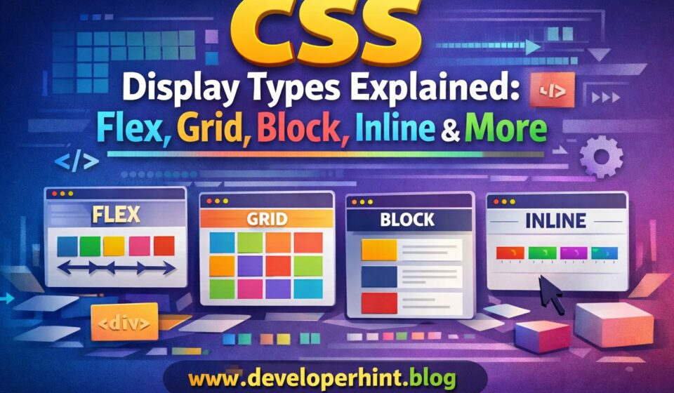

If you’ve ever stared at a layout that wasn’t behaving the way you expected — an element refusing to accept a width, two items stacking when they should sit side by side, a container collapsing for no obvious reason — there’s a good chance the display property was at the root of it.
It’s one of those CSS properties that looks simple on the surface. You use display: flex all the time, maybe display: none to hide things. But there’s a lot more to it, and understanding the full picture makes debugging layouts much faster.
This guide walks through the most important display values — what they actually do, when to reach for them, and a few places where beginners commonly get tripped up.
What Does the CSS Display Property Actually Control?
At its core, display controls two things: how an element behaves in relation to its surroundings (its outer display type), and how it arranges its own children (its inner display type). When you write display: flex, you’re telling the browser: “treat this element like a block on the outside, and use flexbox to lay out everything inside it.”
The syntax is simple:
element {
  display: value;
}
But the effect that one property has on your entire layout is anything but small. Let’s go through each value.
1. display: block
Block elements are the workhorses of page structure. They start on a new line, stretch to fill the full width of their container, and stack on top of each other vertically by default.
.section {
  display: block;
}
Elements like <div>, <p>, <h1> through <h6>, <section>, and <article> are block-level by default — browsers apply this through their built-in stylesheets before your CSS even loads.
You’ll rarely need to write display: block explicitly unless you’re overriding a different display value, or making an inline element (like an <a> tag) behave like a block so it fills its container.
2. display: inline
Inline elements flow with text. They sit on the same line as surrounding content, only take up as much width as their content needs, and ignore width and height properties entirely.
span {
  display: inline;
}
Common inline elements include <span>, <a>, <strong>, and <em>. If you try to set a fixed width or height on one of these and nothing happens, that’s why — inline elements simply don’t respond to those properties.
Inline is the default display value in the CSS specification, though browser stylesheets override this for most structural elements like headings and paragraphs.
3. display: inline-block
This is the best of both worlds. An inline-block element sits in line with surrounding content like an inline element, but it respects width, height, padding, and margin like a block element.
.badge {
  display: inline-block;
  width: 80px;
  height: 30px;
  padding: 4px 12px;
}
It was the go-to tool for building nav menus and button rows before Flexbox became widely supported. These days Flexbox handles most of those cases more cleanly, but inline-block is still useful for things like icon badges, styled tags, or any situation where you need an element to flow with text while still having controlled dimensions.
4. display: flex
Flexbox is probably the display value you use most, and for good reason. It turns a container into a flexible row (or column) where items align themselves along a single axis, and distributing space between them becomes trivially easy.
.navbar {
  display: flex;
  justify-content: space-between;
  align-items: center;
}
What made Flexbox such a big deal when it arrived is that it solved problems that had been genuinely annoying in CSS for years — vertical centering, equal-height columns, evenly spaced items. All of that became a few lines of code instead of a stack of hacks.
Flexbox works along one axis at a time. That’s not a limitation so much as its design intent — it excels at laying out components: navbars, button groups, card rows, toolbars, form fields. Anything where you need items aligned in a line.
5. display: grid
CSS Grid operates in two dimensions simultaneously — rows and columns at once. That’s the fundamental difference from Flexbox, and it’s what makes Grid the right tool for full page layouts rather than individual components.
.layout {
  display: grid;
  grid-template-columns: 250px 1fr;
  grid-template-rows: auto 1fr auto;
  min-height: 100vh;
}
With those four lines you have a complete page structure — fixed sidebar, flexible content area, header and footer — without a single float or clearfix in sight.
Grid also shines for responsive card layouts:
.cards {
  display: grid;
  grid-template-columns: repeat(auto-fit, minmax(250px, 1fr));
  gap: 20px;
}
This creates a grid that automatically adjusts the number of columns based on available screen width — no media queries needed.
| Feature | Flexbox | CSS Grid |
|---|---|---|
| Dimensions | One axis (row or column) | Two axes (rows and columns) |
| Best for | UI components, alignment | Page layouts, complex structure |
| Item placement | Content-driven | Layout-driven |
| Learning curve | Gentler | Steeper, but more powerful |
In practice, most professional developers use both together: Grid for the overall page structure, Flexbox inside the individual components.
Flex vs Grid: When to Use CSS Flexbox and CSS Grid Layout
6. display: none
This one removes an element from the page completely. Not just visually — the element disappears from the layout entirely and takes up no space.
.hidden {
  display: none;
}
It’s commonly used to show and hide elements with JavaScript — toggle a class to switch between display: none and display: block.
The important distinction to know is how it differs from visibility: hidden. Both make an element invisible, but they behave very differently:
display: none— element is invisible and removed from layout. The space it occupied collapses.visibility: hidden— element is invisible but its space is preserved. The gap remains.
Which one you need depends entirely on whether you want surrounding content to shift when the element is hidden.
7. display: contents
This is one of the less-known values and it does something genuinely unusual. It makes the container element’s box disappear, while its children remain visible and participate in the parent layout as if the wrapper never existed.
.wrapper {
  display: contents;
}
A practical use case: you’re building a Grid layout and you need an extra wrapper <div> for semantic or structural reasons, but you don’t want it to break the grid flow. Applying display: contents to that wrapper lets the children participate in the grid directly.
One important caveat: display: contents has a known accessibility issue in some browsers where it removes the element from the accessibility tree, which can affect screen readers. Use it carefully, especially on elements that carry semantic meaning like <button> or <a>. This is a known bug being addressed in browsers, but it’s worth testing before deploying.
8. display: flow-root
This one is less glamorous but genuinely useful when you need it. It creates a new block formatting context — essentially a self-contained layout environment where floated children are contained and margins don’t collapse unexpectedly.
.container {
  display: flow-root;
}
Before this existed, developers used clearfix hacks (::after pseudo-elements with clear: both) to stop floated children from overflowing their containers. display: flow-root does the same job in one line, cleanly. If you’re working with any code that still uses floats — legacy codebases, email templates — this is a much cleaner solution than clearfix.
9. display: table (and Related Values)
CSS can simulate HTML table behavior without using actual <table> markup. The related values include table, table-row, table-cell, and table-column.
.container {
  display: table;
}
.row {
  display: table-row;
}
.cell {
  display: table-cell;
  vertical-align: middle;
}
Honestly, you’ll rarely need this for new projects. It was useful before Flexbox and Grid arrived because display: table-cell was one of the few reliable ways to vertically center content. These days Flexbox handles that far more elegantly. The main scenario you’d reach for table display values today is if you need to maintain compatibility with very old browsers or are working in environments where Flexbox isn’t available (like some HTML email clients).
Common Mistakes Worth Knowing About
Trying to set width or height on inline elements
This is a classic beginner frustration. You write:
span {
  width: 200px;
  height: 50px;
}
And nothing happens. That’s because span is inline by default, and inline elements ignore width and height. The fix is either display: block or display: inline-block, depending on whether you need it to stay on the same line as surrounding content.
Confusing display: none with visibility: hidden
Both hide an element visually, but their effect on layout is completely different. If you hide something with display: none and the surrounding elements jump around, that’s expected — the space collapses. If you want the space preserved, use visibility: hidden instead.
Using Flexbox for everything
Flexbox is intuitive and it’s easy to default to it for every layout problem. But when you’re building something that needs both rows and columns — a full page layout, a dashboard, a gallery — Grid is almost always the cleaner solution. Fighting Flexbox into doing two-dimensional layout is possible, but it’s harder than just using the tool that was built for it.
Quick Reference: Which Display Type Should You Use?
- Block — structural containers, sections, anything that should sit on its own line and fill available width
- Inline — text-level elements, links, small formatting pieces that flow inside a paragraph
- Inline-block — elements that need controlled size but should flow with surrounding content, like tags or badges
- Flex — alignment and spacing of items along a single axis: navbars, button groups, card rows, centering
- Grid — two-dimensional layouts: full pages, dashboards, responsive galleries, any structure with rows and columns
- None — hiding elements and removing them completely from the layout
- Contents — removing a wrapper element from layout without removing its children
- Flow-root — containing floated children, preventing margin collapse, cleaning up legacy float-based layouts
Final Thoughts
The display property is foundational to everything in CSS layout. Most developers pick up block, inline, and flex early on, then spend years occasionally stumbling over the others when a layout misbehaves in a specific way.
Understanding the full picture — especially the difference between display: none and visibility: hidden, when to reach for flow-root, and what contents actually does — means you spend less time guessing and more time building. That’s really what learning CSS fundamentals is about: not memorizing syntax, but recognizing which tool fits the problem you’re actually looking at.
Discover more from Developer Hint
Subscribe to get the latest posts sent to your email.
Content Disclosure
This content was created with the assistance of AI tools and thoroughly reviewed, fact-checked, and refined by a human editor to ensure accuracy, clarity, and usefulness for readers.Advertisements