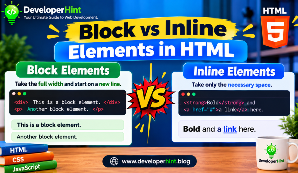

Every element on a web page has a default display behavior, and the two you will meet first are block and inline, Block vs inline elements is one of those topics that looks trivial until a layout refuses to do what you want, you set a width on a link and nothing happens or two boxes that should sit side by side stack on top of each other, nearly every time, the cause is the display type.
A block element starts on a new line and stretches across the full width of its container by default. An inline element sits inside the flow of a line of text, takes up only as much room as its content needs, and does not force a line break.
<div>This is a block element.</div>
<div>So is this one, so it sits on its own line.</div>

<p>This paragraph has an <span>inline span</span> and a <a href="#">link</a> that stay inside the same line.</p>
How block elements behave
A block element begins on a fresh line and, unless you say otherwise, expands to fill the available width of its parent because it owns the whole line, anything that comes after it starts below, Block elements respect every part of the box model: you can set width and height, and margin and padding work on all four sides.
Common block elements include div, p, the heading elements h1 through h6, ul, ol, blockquote, pre, form, and the semantic layout elements like header, main, section, article, nav, and footer, a few have more specific display values, such as li, which uses list-item, and table, which uses table, but they still behave like blocks in terms of stacking.
Centering a block element
Since a block fills its container, you cannot see it centered until you give it a width, once it has one, setting the left and right margins to auto splits the leftover space evenly.
.card {
  width: 600px;
  max-width: 100%;
  margin: 0 auto;
}
How inline elements behave
An inline element does not start a new line, it flows along with the text around it and wraps to the next line when it runs out of space, just like a word would, Its width is determined by its content, and that is the part that catches people out, setting width or height on a normal inline element has no effect.
Margin and padding behave differently on the two axes, horizontal margin and padding push neighboring content away as you would expect, vertical padding and border will draw outward, but they do not push surrounding lines apart, so they can overlap the text above and below, vertical margin on an inline element is ignored entirely.
Typical inline elements are span, a, strong, em, code, label, abbr, and br, Images are a special case, an img is inline by default, but it is a replaced element, meaning the browser swaps it for external content, so it does accept width and height.
Block vs inline elements
| Behavior | Block | Inline |
|---|---|---|
| Starts on a new line | Yes | No, flows with the text |
| Default width | Fills the container | Only as wide as its content |
| Width and height | Respected | Ignored, except on replaced elements like img |
| Vertical margin | Works | Ignored |
| Horizontal margin and padding | Works | Works |
| Common examples | div, p, h1 to h6, ul, section, form | span, a, strong, em, code, label |
The in-between option: inline-block
Sometimes you want an element to sit in a line with its neighbors but still accept a width and height, that is what display: inline-block does, the element flows like inline content, yet it behaves like a block internally, Buttons and form inputs work this way by default, which is why you can size them and still place several in a row.
.badge {
  display: inline-block;
  width: 80px;
  padding: 4px 0;
  text-align: center;
}
Inline-block is handy for small things like badges, tags, and buttons, for larger layouts, it has been mostly replaced by Flexbox and Grid, which handle spacing and alignment far more cleanly.
Changing the display type with CSS
Block and inline are only defaults, the display property can change either one, and HTML itself does not decide this, A browser’s built-in stylesheet assigns the defaults, and your own CSS overrides them, that is why a span can act like a block and a div can act like inline text.
/* Make links fill the full width of the menu */
nav a {
  display: block;
  padding: 0.75rem 1rem;
}

/* Put list items on one line */
.tabs li {
  display: inline-block;
}
The first example is a common pattern, making a navigation link a block means the whole padded area is clickable, not just the text, that is a real usability gain, especially on touch screens.
Nesting rules worth knowing
Inline elements generally belong inside block elements, not the other way around, aparagraph can hold spans, links, and emphasis, the reverse is where things go wrong, the p element can only contain phrasing content, which is roughly the inline text-level stuff, so if you put a div inside a p, the browser quietly closes the paragraph before the div, your markup then ends up different from what you typed, which can break styling in confusing ways.
There is one useful exception, in HTML5, the a element can wrap block-level content, such as a whole card made of a heading, an image, and a paragraph, as long as there is nothing interactive nested inside it.
Common mistakes to avoid
The most frequent one is trying to size an inline element and wondering why nothing changes, another is using div for everything and losing the meaning that semantic elements provide, beginners also tend to reach for br tags to create space between elements, when margin or padding on a block would do the job and keep the markup clean, and putting block elements inside a p is a quiet source of broken layouts.
Use block when you are building sections of a page, like a header, a card, or a list, where each piece should occupy its own row, use inline for text-level details inside a sentence, such as a link, a highlighted word, or a snippet of code, reach for inline-block when you need a small, sizable item that still sits in a line, like a tag or button.
For anything bigger, such as navigation bars, card grids, or page layouts, start with Flexbox or Grid.
Discover more from Developer Hint
Subscribe to get the latest posts sent to your email.
Content Disclosure
This content was created with the assistance of AI tools and thoroughly reviewed, fact-checked, and refined by a human editor to ensure accuracy, clarity, and usefulness for readers.Advertisements