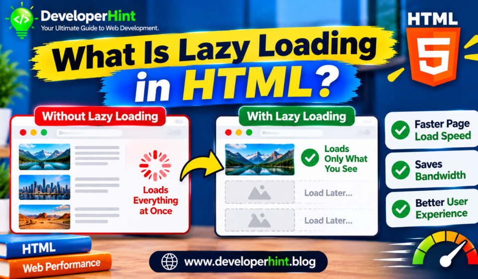

Lazy loading in HTML is a way of telling the browser to hold off on loading images and iframes until the visitor is about to see them, instead of downloading every picture on a long page the moment it opens, the browser fetches the ones near the top first and picks up the rest as the visitor scrolls.
For pages with a lot of media, that can mean faster first loads, less wasted data, and a smoother experience on slow connections, it also takes one attribute to switch on.
The basic idea
Normally a browser requests every image on a page as soon as it finds it in the HTML, even if that image sits far below the visible screen, if the visitor never scrolls that far, the download was wasted.
Lazy loading changes the rule, the browser waits until the element is close to entering the viewport before it fetches the file.
The attribute that does this is loading, and it has two values.
A value of lazy delays loading until the element is near the viewport, and eager loads it right away.
Eager is the default, so an image without the attribute behaves as if you had written it.
<img src="team-photo.jpg" alt="The team at the 2026 meetup" width="800" height="533" loading="lazy">Native lazy loading works in all current major browsers, including Chrome, Edge, Firefox, and Safari, so you no longer need a JavaScript library for the common case.
Lazy loading iframes
The same attribute works on iframe elements, which is useful for embedded videos, maps, and widgets.
An embedded video player pulls in a surprising amount of code, so delaying one that sits halfway down the page can make a real difference.
<iframe
  src="https://www.youtube.com/embed/VIDEO_ID"
  title="Product walkthrough"
  width="560"
  height="315"
  loading="lazy">
</iframe>
Always set width and height
If the browser does not know how big an image will be, it cannot reserve space for it, when the image finally loads, the content below jumps down to make room that jump is called layout shift, and it is annoying for readers and counts against you in Core Web Vitals, specifically the Cumulative Layout Shift metric.
Lazy loading makes the problem more likely, since images arrive later.
The fix is to put the real width and height attributes on every image, modern browsers use those numbers to work out the aspect ratio and hold the right amount of space before the file arrives.
If your CSS makes the image responsive, keep the attributes and add a rule like this:
img {
  max-width: 100%;
  height: auto;
}
When not to use lazy loading
This is the part people most often get wrong, lazy loading helps with content that is off screen, and it hurts content that is on screen, the first big image a visitor sees, such as a hero banner or the main article photo, is usually what the browser treats as the Largest Contentful Paint element, if you lazy-load it, you ask the browser to delay the most important image on the page, which makes the page feel slower.
The simple rule is to leave images in the first screenful of the page at the default eager behavior, and add loading="lazy" to the ones further down.
For the main image, you can go a step further with fetchpriority="high", which hints that the browser should fetch it early.
<!-- Above the fold: load right away and prioritize -->
<img src="hero.jpg" alt="Mountain trail at sunrise" width="1600" height="900" fetchpriority="high">

<!-- Below the fold: lazy load -->
<img src="gallery-1.jpg" alt="Hikers resting by a lake" width="800" height="533" loading="lazy">
When to use it?
| Content | Lazy load it? | Why | Best for |
|---|---|---|---|
| Hero image or main photo at the top | No | It is likely the Largest Contentful Paint element | Loading eagerly, with fetchpriority high |
| Logo and header images | No | They are visible immediately | Default eager loading |
| Images further down a long article | Yes | Many visitors never scroll that far | Blog posts and long guides |
| Product grids and galleries | Yes, after the first row or two | Large numbers of images load unnecessarily | Shops and portfolios |
| Embedded videos and maps | Yes, if below the fold | Iframes are heavy and slow to start | Pages with several embeds |
Lazy loading in WordPress
If you use WordPress, you are probably already using lazy loading without knowing it. WordPress has added loading="lazy" to images by default since version 5.5, and later releases refined the behavior so the first images on a page are not lazy-loaded and the likely main image gets a higher fetch priority.
The details have changed across versions, so inspect the HTML your theme outputs and check that your top image is not marked lazy, some themes and page builders add their own lazy loading on top, which can cause conflicts, so keep an eye on it if images appear late or not at all.
Lazy loading and SEO
Search engines can handle native lazy loading, Googlebot supports the loading attribute, and as long as your images are in the HTML with a real src, they can be discovered and indexed.
Trouble arises with older JavaScript techniques that wait for a scroll or click before inserting the image, because a crawler that does not scroll may never see it.
If you build your own version, use the Intersection Observer API and make sure the real image URL ends up in the markup.
Lazy loading works best alongside a few other basics, serve images at the size they are displayed, use modern formats like WebP or AVIF where you can, and use srcset so smaller screens receive smaller files, compress what you upload. I
f you only do one thing, apply loading="lazy" to images below the first screen, set their dimensions, and test the result.
A JavaScript fallback for special cases
The loading attribute only covers img and iframe, it does nothing for CSS background images, and you may want finer control, such as fading an image in.
In those cases you can use the Intersection Observer API, which tells you when an element enters the viewport.
<div class="bg-lazy" data-bg="images/banner-large.jpg"></div>const targets = document.querySelectorAll(".bg-lazy");
const observer = new IntersectionObserver((entries, obs) => {
entries.forEach((entry) => {
if (!entry.isIntersecting) return;
const el = entry.target;
el.style.backgroundImage = `url(${el.dataset.bg})`;
obs.unobserve(el);
});
}, { rootMargin: "200px" });
targets.forEach((el) => observer.observe(el));The rootMargin setting starts loading a little before the element reaches the screen, so the image is usually ready by the time the visitor gets there, this approach is more work than the native attribute, so reach for it only when the attribute does not cover your case.
Common mistakes to avoid
The biggest one is lazy-loading the top image of the page, a close second is leaving out width and height and then watching the layout jump around.
Others include applying lazy loading to tiny icons that cost almost nothing, stacking a JavaScript library on top of the native attribute so that images load twice, and forgetting that lazy loading is turned off in browsers when JavaScript is disabled, so you should not rely on it for anything critical.
Finally, lazy loading is not a replacement for good image habits, since an oversized image is still oversized when it loads late.
Why this matters for developers
Page speed has a direct effect on how people experience your work, and images are usually the heaviest part of a page, lazy loading is one of the highest-return changes you can make, since it costs a single attribute and a few seconds of thought.
It also introduces a good lesson in judgment, because the same attribute that speeds up a long article can slow down a hero image, measure before and after with the Lighthouse panel in your browser’s developer tools or with PageSpeed Insights, and pay attention to Largest Contentful Paint and Cumulative Layout Shift.
A good exercise is to take a long page of your own, add loading="lazy" to every image below the fold, set the width and height on each one, and compare the network panel before and after.
Watching the requests spread out as you scroll makes the idea click quickly.
Discover more from Developer Hint
Subscribe to get the latest posts sent to your email.
Content Disclosure
This content was created with the assistance of AI tools and thoroughly reviewed, fact-checked, and refined by a human editor to ensure accuracy, clarity, and usefulness for readers.Advertisements